Designing a digital service for funeral arrangers
Giving time back to funeral directors to spend with clients. Replacing paper processes and ingenious hacks with a single service. Live across 1,059 branches in a business arranging 90,000 funerals a year.
The business
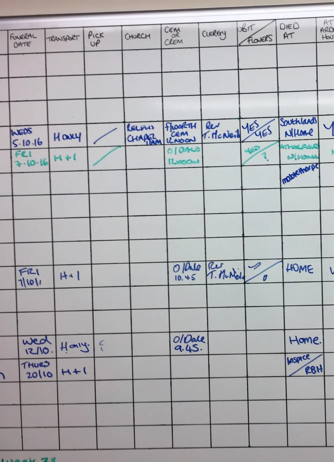
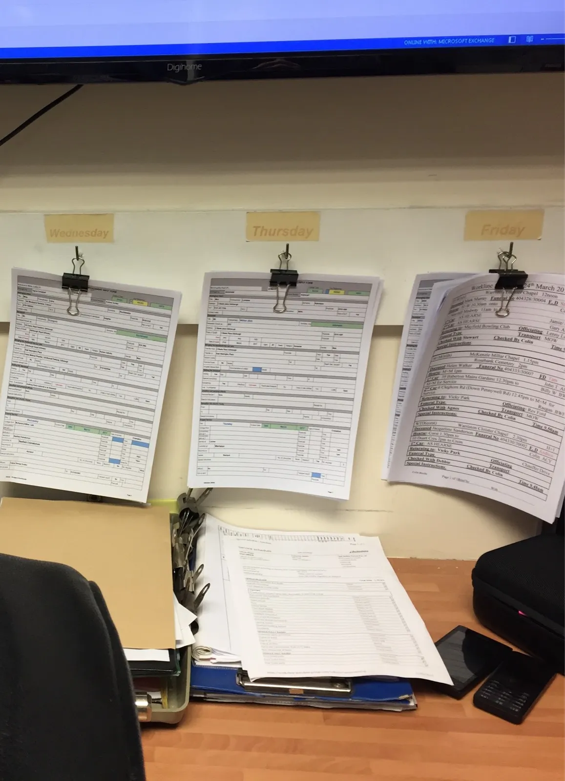
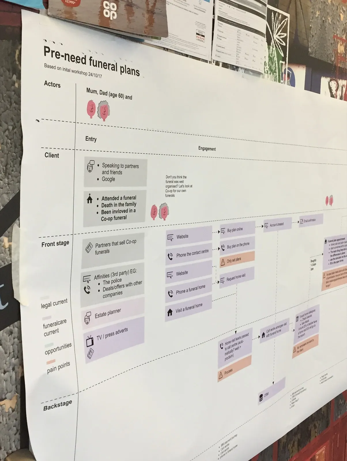
Co-op is the largest funeral business in the United Kingdom, arranging around 90,000 funerals a year. It is a care service, and a traditional one. When this work started it ran on paper forms, whiteboards, post-it notes, paper diaries, fax machines and software that got in the way more than it helped.
A funeral director could spend six hours on admin for a single funeral. Filling in forms, checking vehicles, ringing round for coffins and flowers, confirming who was officiating, driving and bearing. One of the first funeral directors we met kept her entire system in a plastic folder of paper forms. It worked for her. It also meant everything in that folder was invisible to everybody else.
The Operations Director’s vision was one sentence: give time back to funeral directors to spend with clients.
What I like most about Guardian is that it means I get a better work life balance, I can go home and finish admin there, rather than having to go back to the office. I get to spend more time around my kids.
A Funeralcare colleague
My role
- Interaction and service design across the entire end-2-end chain of care.
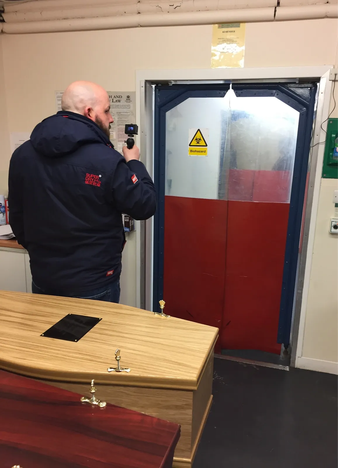
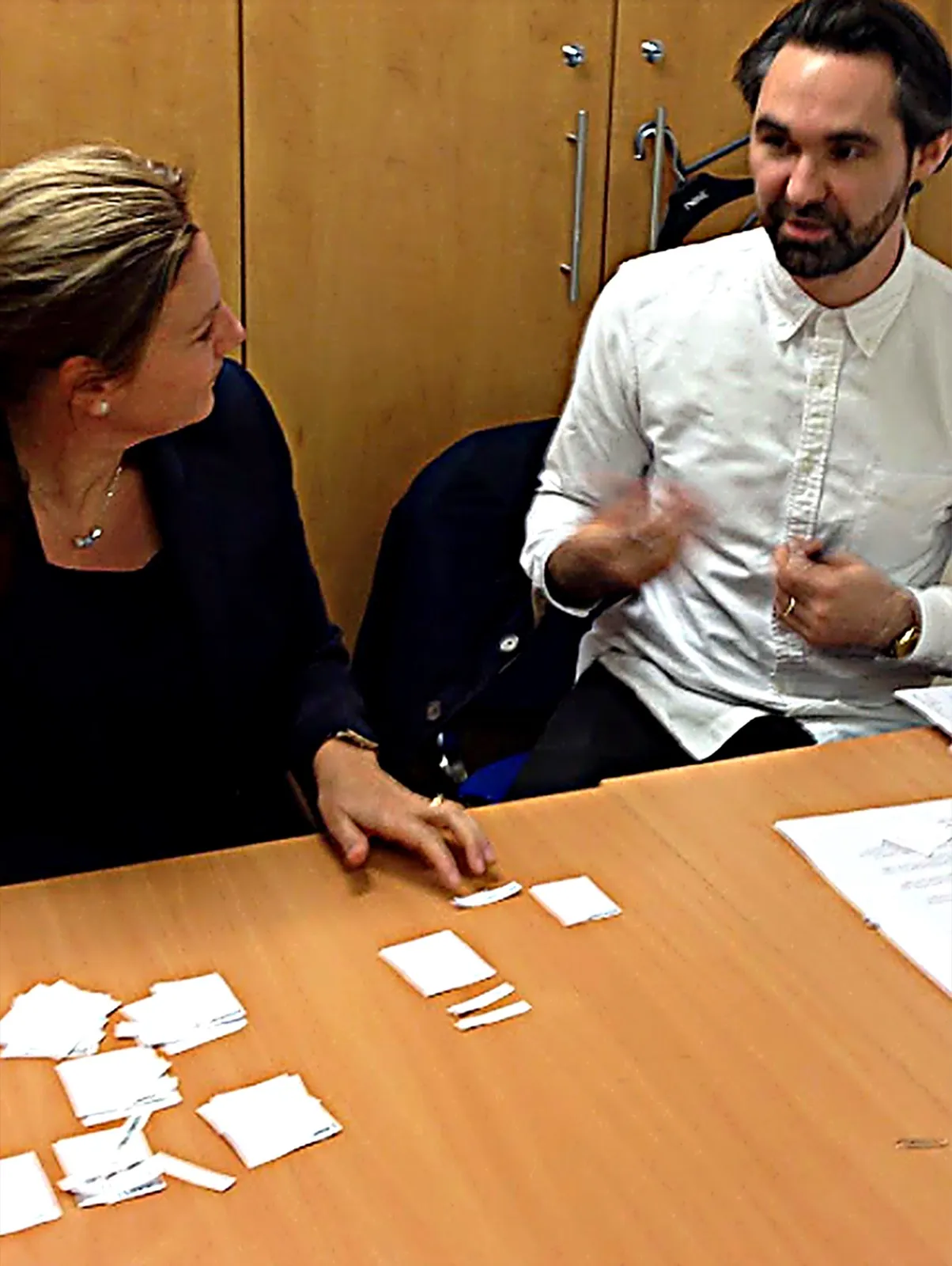
- Research in funeral homes and mortuaries.
- Lean UX, working sketch to code to enable fast feedback loops
- Front-end build for much of the service itself
- Working with stakeholders to understand the full service, its pain-points and technical feasibility and crossover with other services.
- Presenting research findings and design rationale to the team and wider business
The problem
Every funeral is different, and colleagues told us so constantly. Funerals vary by region for reasons including local tradition, operational setup, affluence, traffic and legislation. So the obvious answer, one standard process everybody follows, was the wrong answer.
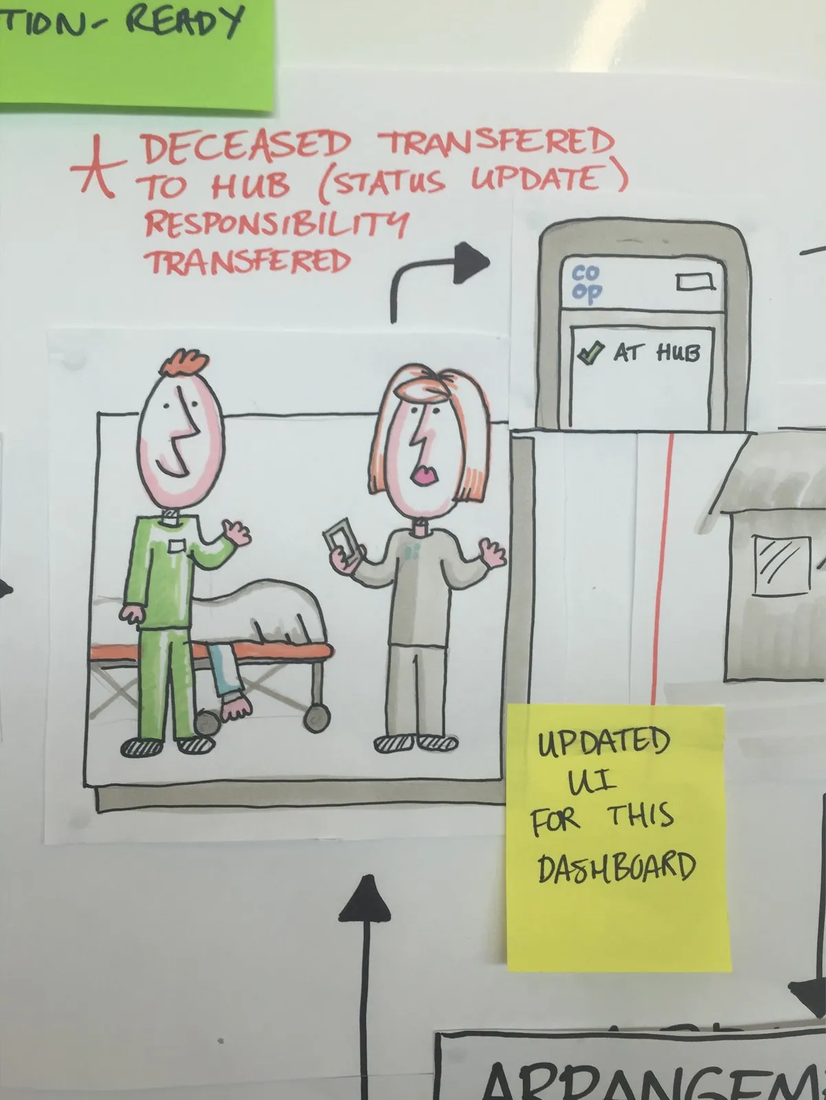
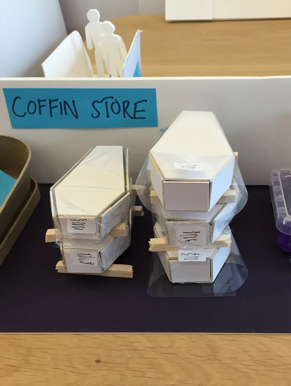
The information that mattered most also turned out not to be the information on the forms. It was knowing where a person in our care was, who had them, and what they had come in with. When a grieving family rang to ask about their mother’s jewellery, the answer was on a sheet of paper in a mortuary in a different building.
Constraints
In a business where care and accountability are key we had constraints around:
- having real bereaved families involved, nothing could be tested in a way that risked a funeral going wrong.
- colleagues with home-grown systems that already worked, anything new had to be visibly better or it would be ignored.
- old buildings and thin infrastructure, thick walls, weak wifi, mortuaries and garages with no coverage at all.
- a workforce with a range of confidence with technology.
- alpha and beta trials planned in that had to be met in order to ensure minimal disruption to colleagues.
Key decisions that shaped the service
Creating a chain of care, not a set of forms
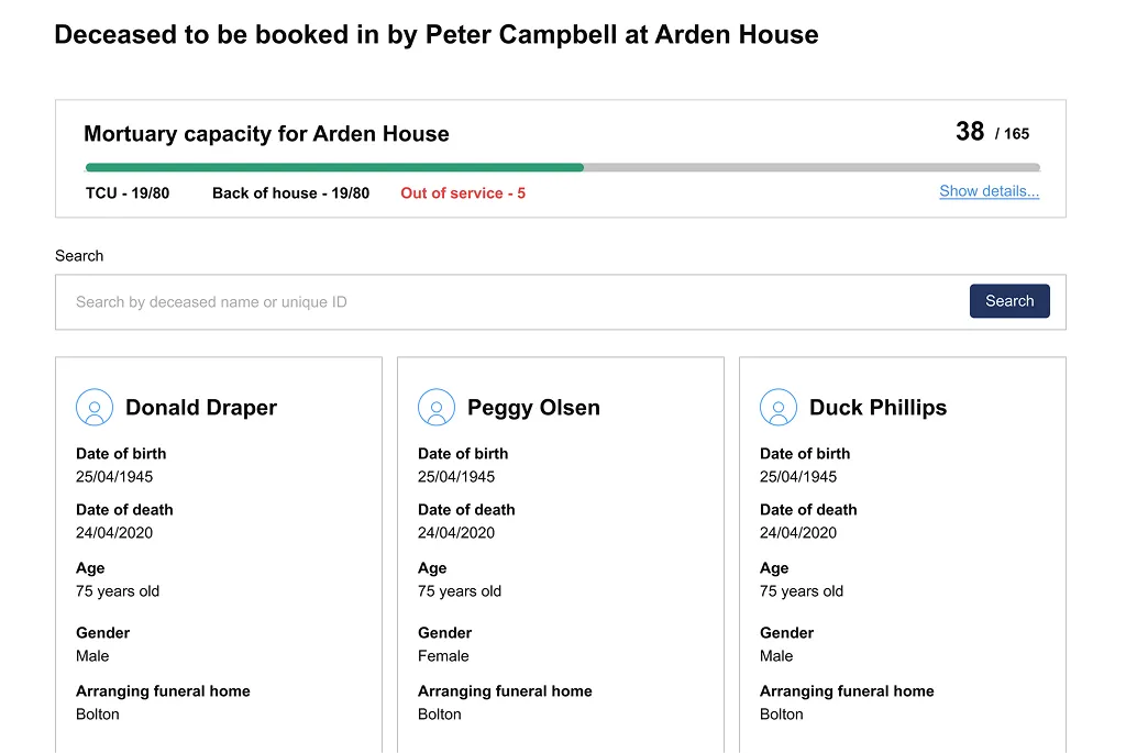
The instinctive brief was to make the paperwork faster. However the real need was traceability: An unbroken record of who is in our care, where they are, and what they arrived with. That is what produced the digital mortuary register, the belongings log and the audit trail. None of those are form replacement features and none of them would have come out of a brief to digitise the paperwork. At the time the industry was unregulated, this put Co-op in a strong position when regulations came in.
Previously, we’d have had to make lots of phone calls to consolidate the paper mortuary registers in all the branches.
A Funeral Director
Designing for variation
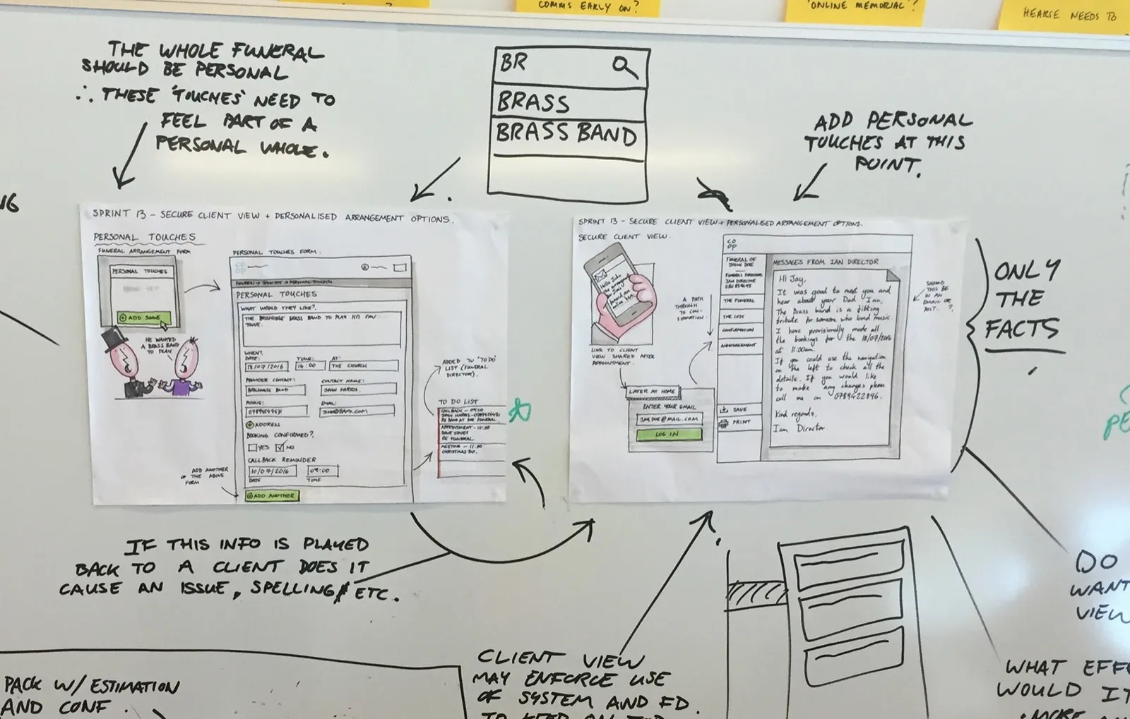
A single linear process isn't how life and emotions work. We designed for the fact that there is no typical funeral, including fields so a colleague could note that someone had been a lifelong football fan, and then suggest flowers in their colours or a route past the ground. Harder to build, harder to keep coherent, but true to the way that funerals actually happen and the care that colleagues put in to them.
Running a live parallel trial rather than staying in the office
We tested features from September to November 2017, then in December put the service into a real funeral home in Bolton alongside the existing paper process. Colleagues arranged real funerals both ways at once. Slower, more expensive, and the only way to find out what was working and what wasn't.
What we got wrong, and how we changed course
Gloves in the mortuary
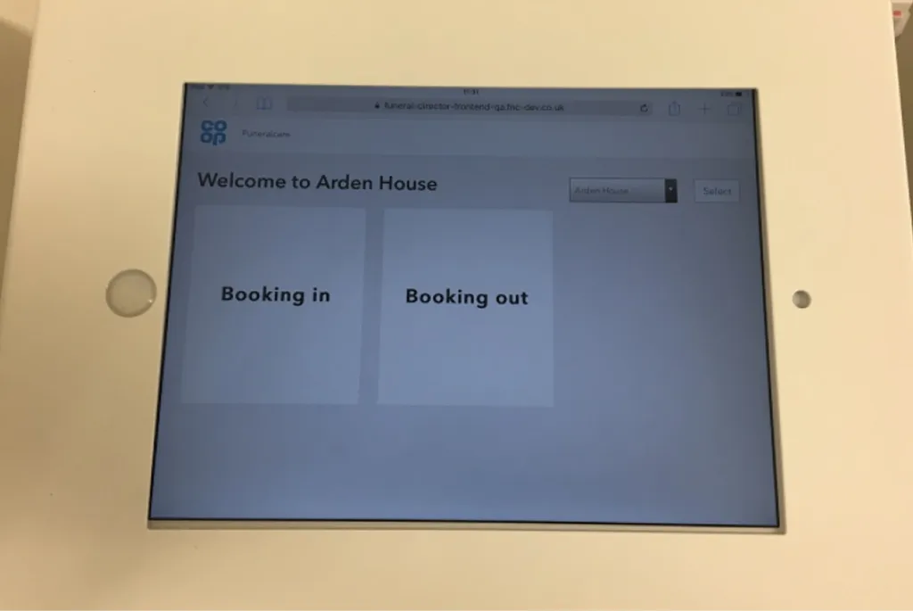
I designed the booking in and out of the deceased as a touch screen application on an iPad. It tested well.
Then we took it into a real mortuary and watched an embalmer work. He was wearing surgical gloves.
Nobody on the team had considered it. Standing there, we didn't know whether a touch screen would register through surgical gloves. It did, but we got lucky, we'd travelled all the way to Edinburgh just to test the mortuary booking flow.
What we could see clearly, once we were looking, was that the interface was not built for the way this person actually worked. Contrast was not high enough for the lighting in the room. Controls that were comfortable under a bare fingertip were fiddly through a glove. We redesigned for it in the next phase. I made the flow higher contrast, with larger controls and we made sure we had latex gloves to use in the office when using the app ourselves.
The hardware changed underneath us
When the Guardian roll out happened, the tablets that went to branches were cheaper devices with poor touch screen sensitivity and worse resolution than the ones we had designed and tested on.
I had to iterate again, this time designing within the funeral homes rather than at the office. The app was working well now, but in hindsight I would have understood the procurement process more clearly than I did.
Research findings from the beta trial
The Bolton beta trial caught three things that months of usability testing had missed. We had:
- preloaded local churches and crematoriums to be helpful, and gave nobody a way to add one that was not on the list.
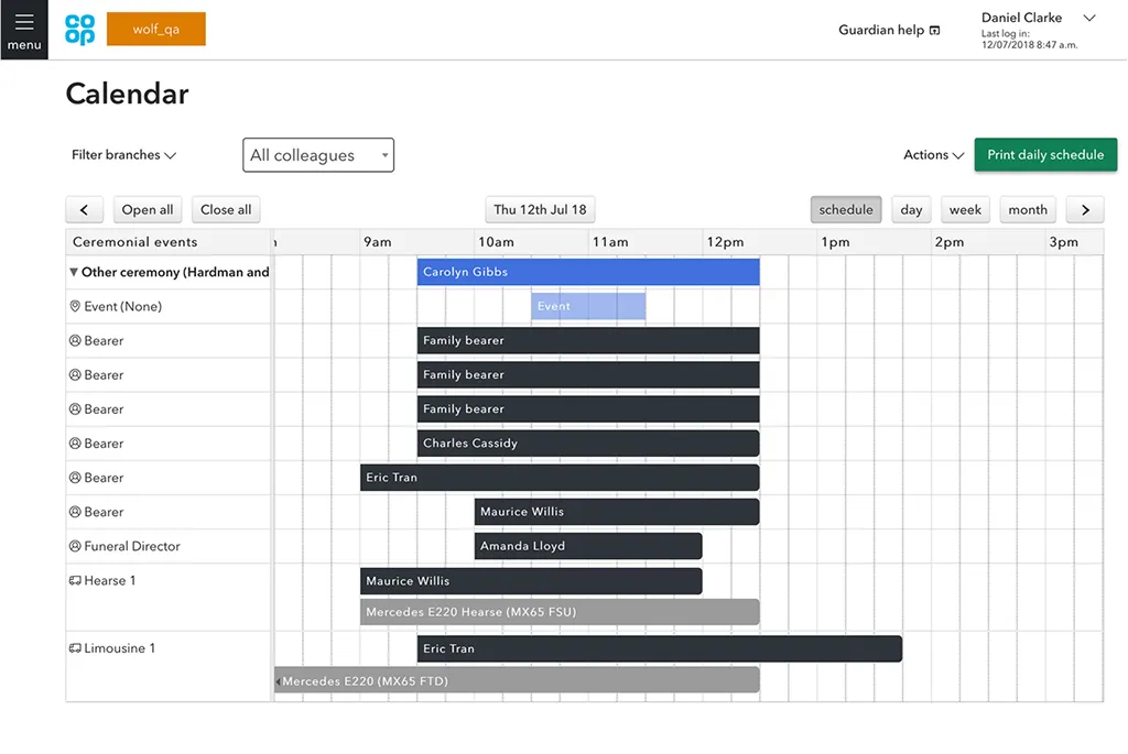
- a calendar that could not handle all day events.
- built role-restricted access, which broke the moment a colleague was off ill and someone else covered. Colleagues help each other. Our permissions model assumed they didn't.
What I took from it
An interface is only as good as the conditions it is used in. Lighting, gloves, cold hands, a device held one handed while doing something else. None of that shows up in a research session and all of it decides whether the thing works.
Service design helps us find the hidden variables that can affect a service. The hardware, the network and the procurement decision are all part of the experience. If you're not in those conversations, design decisions are being made for users without the impact always being known.
Outcomes
- Live in every branch. 4,014 colleagues across 1,059 branches in England, Scotland and Wales by September 2018.
- 30,425 funerals arranged through the service by that point, up from 16,642 three months earlier.
- Time given back to colleagues: Our vision and something we ensured did not slip as we delivered.
- Data where there had been none: Time in care at each stage became measurable for the first time, opening up demand prediction, fleet use, and giving the call centre real answers for families ringing in.
- Help moved inside the product: Guidance had been sitting on the intranet where nobody looked. The in-product help section had more visits in a fortnight than the intranet had in seven months.